Tuesday, 7 December 2010

Rough and Unready

Jeez -- feels like I blinked and a month passed! I got knocked on my ass by a heavy-duty cold earlier and have been playing catch up since.

I was tidying the studio this past weekend and an envelope of old sketches turned up, so I thought I'd share them since everything else I'm working on is bound by NDAs at the moment.

I think I shared a scan of the Rune cover rough before, but not the rough adjacent to it. I drew 'em on tracing paper for some reason and the paper has been through a bit.

The rough and a photocopy of the finished (unused) solicitation art for my Pitt one-shot.

I did a cover for an Arthurian novel years back. Was pretty proud of it at the time, but it was based on a rough I was less than enthused about (top left guy with sword). I really wanted to do the portrait of the lady with the freaky hands holding the roses in front of a rose hedge.
I think I would have been happy painting the weird court tableau as well. I am rightly embarrassed over the horse in the other sketch..
Two roughs for another cover -- the one used wasn't included in the envelope. It was an in your face painting that was the last acrylic painting I ever completed. I preferred the two roughs here to the one used -- seems to be a common event in most freelancers' lives.
I really grew to hate acrylics over the years and it was having a negative effect on me and the work. I think i started another painting for the same company shortly after and ended up quitting in disgust and self-loathing over the progress.


Not sure what this was for - -perhaps an abandoned idea for an Unknown Armies RPG cover I like the basic idea here, but the drawing and gesture is atrocious.

The semester is winding down and I have a very light course load for the next, so I believe i can start producing more regular updates within a week or so -- perhaps a return to sketch-cards.

~R

Tuesday, 9 November 2010

Onnaboat

The Animation students at Durham College started a weekly drawing challenge via Facebook and it looks like the instructors are invited to participate. First up was a pirate pin-up.

I gave myself an hour to turn this around -- which is still more time that I could really afford. Started with a quick sketch:

Then I played with it in photoshop until time was up:

I prefer my Belit from a few years back for a sexy pirate, but I'm a little wary of putting any sort of pin-up style nudity over on facebook.

Monday, 1 November 2010

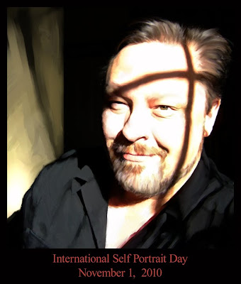
International Self Portrait Day, 2010 - Final

Seven hours from photo reference. Worked 12x12@300dpi.

I ended up fixing most of the problems I was having in Painter using the water rake blender before popping it back into Photoshop and continually tweaking the values (popping in and out of greyscale).

I'm so used to making tight greyscale images and digitally colorizing them into paintings I really don't know what I'd end up with it I tried acrylics or oils again.

International Self Portrait Day, 2010

I have too much other stuff to do, but I really hate myself when I miss this!

I was commanded to not do another moody/gloomy self-portrait this year, so I have to use photo-reference otherwise I really can't draw myself happy. Not sure why I can't. Perhaps it's some sort of emotional shortcoming or I just can't maintain the same happy look long enough to draw it.
So, me happy in my studio.


Started doing my tonal study and realised how late it was already getting. Last year I think I started much earlier and had time to do a tighter tonal rough to scan and paint over.

Decided I didn't have time and thought I could fix things while working in Photoshop and maybe Painter.

Scanned, colorized and the starting of painting. Decided it needed some other light shape compositionally. Colors need much, much more work. I might try to get that same washed-out look as the ref since I'm not too experienced painting skin with that much light in it.


Going to run some filters, adjustment layers and variations then port it over to Painter for a bit (primarily for the water rake and other blenders) and see what transpires.

Got four hours left. . . .

Friday, 29 October 2010

Dragon Mini-Con

This Saturday I'll be one of the guests at The Dragon in Guelph, Ontario ( link ) for their Dragon Mini-Con.

The fine folks of The Dream Detective Media Properties have provided me with a few copies of the limited remaining Pashanata/Dream Detective comics. Earlier entries in my blog show some of my work for that book. I think the plan is to use them to raise some funds for the Hero Initiative in some combo with a sketch.

If I can find the time between now and leaving Saturday morning I might be able to do something with this:
She's Jill, the main character from a long-in-development project I've been working on. Hopefully finished environment pencils, inks and colors aren't out of the question by Saturday morning.

Monday, 25 October 2010

One more Awake page

Thought I'd share another page from the NYCC exclusive promo comic for the ARE YOU AWAKE web TV project.

Thumbs.

Coming back to the page the first panel in the thumbs reminded me of the famous Raquel Welch cavewoman image, so I decided to actually draw her in the first panel.
There were a few overlays for this page, but the motion comic aspect was abandoned, so I'll not bother sharing those scribblely bits.

Of course, such borrowing should be acknowledged, so the not-so-subtle "Raquel" gets scribbled into the water by her right leg

And here's the final colors and letters.


This was a fun project with great people to work with despite some weird production stoppages that almost blew the NY release date and cut into the time I was actually able to work on this.

Sunday, 24 October 2010

More Awake comics

A little more behind the curtain production stuff from the comic that was given away at NYCC and available free online here: http://www.areyouawake.tv/ .

I drew all the roughs for this in Photoshop. As much as I like pencil and paper, I find the features in Photoshop allow me to work faster and make radical changes with little effort. I used to draw these in marker or pencil, so another benefit is I can even think in colour at this stage. Since I wasn't coloring it, I limited the use of colour to indicate the various narrative states in the comic: essentially present, flashback and dream.


I wasn't originally supposed to ink this, but that didn't work out. The new need to work faster did allow me to try out some things that I wouldn't have been able to do otherwise.

Since I was inking over the blue-line printouts I realised I could just as easily have some of the elements print out black as well and ink over that. So elements created in Photoshop or Sketchup could be dropped in next to things drawn in blue and modified on the board with various pens or brushes.

Oh yeah, this was originally supposed to be a motion comic, so parts of nearly every page had to be drawn and inked separately then assembled in layers. I'm not a big fan of motion comics, so I'm moderately happy that didn't end up happening, but I would have laid out a few pages differently had this been the plan all along.
I think I could have drawn in black and converted to non-photo blue, but I didn't. No idea why it didn't occur to me at the time.

Here're the inks -- well, most of them for this page.

And the rest of them

The page assembled.

And the page lettered and coloured.

It's a strange experience to see someone else's colours on my work since that never really happens to me anymore. It's difficult for me to judge these objectively since the colours are applied and used so very differently from how I approach them -- or how I saw them in my mind's eye while I drew them. The feedback has been generally positive, so that's cool!

I start playing with digital tones and textures almost immediately after this page, so I might show another page process in a few days.

Wednesday, 20 October 2010

Are you Awake?

So I drew over half of a flip-comic late this summer and it was given away recently at the New York Comic Con. It was a media promotion book in advance of a new web series -- you can see and read the whole thing here:

Typical of promotional comics there were a number of weird hurdles and stops and starts to deal with, but I'm generally pretty happy with the result even though much ended up being rushed and the basic fact that I'm usually only close to ever being satisfied when I'm doing everything.

I drew and colored the cover, designing the images to bleed into each other a bit but still maintain a certain strength and covers on their own.

The roughs were drawn in Photoshop -- something I'm doing more of lately.

I decided to try penciling the covers in Pshop as well. I printed the drawing onto 2-ply bristol after converting the image into a 25% cyan -- essentially non-photo blue.

Inks were just the same old application of pen and brush.

The work was scanned and colored in photoshop. I think i used more colour holds than I ever have before. I liked what I was able to play with here and plan to experiment further.

Here's the cover flipped so you can see it both ways.

I'll probably post more from the interiors over the next little while -- hope you guys find this interesting.

Diagonals!

Had a frustrating day introducing 2-point perspective, but I was actually quite surprised at what seemed to be tripping some of these students up. It's a pretty simple concept -- at least I think it is -- but I thought it might be a good idea to put the relevant info together either to make a handout (which I think promotes intellectual laziness) or a web resource of some sort (which may still inspire some students to be less mentally disciplined, but may save me from explaining the same concept weeks after it was initially introduced).

If this proves useful I might end up doing my whole curriculum in this manner and start a site or blog just to host it as a resource.

So, here's my primer on rectangles and diagonals in perspective.


Note:
The code for this entry got horribly messed up as I uploaded some corrections so I deleted the previous version and just put it up as a new entry -- sorry about the lost comments as a result.

Also, I seemed to have glossed over it in the original: this isn't a full perspective lesson by any means and much of the above info could be quite confusing to anyone not aware of the terminology and set up I'm using with my students.

~R

Tuesday, 31 August 2010

Fanexpo 2010 Day Three (a day late)

Got up way too early to get cracking on the pile of work I have to do this week and I found this in my e-mail in-box:

This pic of one of a Conan piece I forgot to take a photo of at the con! Awesome start to the day!
Thanks again, David!

I had a great time at the convention, even though I (and reportedly so many others) had issues getting back into the MTCC if they left. The gentleman who originally commissioned the above Conan e-mailed me yesterday telling me the re-entry line-up put him past his alloted time to be at the show.

I chalk it up to growing pains for the con and expect that problems had this year will not repeat next year.

The next con I'm planning on attending is the October 8-10 NYCC, though I'm really using that as an excuse to visit NY again since I haven't gone in nearly ten years.

Sunday, 29 August 2010

Fanexpo 2010 Day Two


Alright -- typing this at three in the ay-em.

Yawn!~

Today was hot, busy and exhausting! Never seen a Fanexpo so packed with people. I suspect, for a number of reasons, that the overcrowding may backlash a bit; people had to wait to reenter after the staff were told the building was at capacity and I saw that it was quite difficult for people to move in the aisles which may have hurt sales for some of the booths. I've no idea what could be done to remedy this but I expect some changes may be in the offing. This is the first time in a while it was held at the Front Street half of the MTCC -- if it's actually a smaller venue I think it'll have to move the southern hall (which always felt larger).

I don't think I'd be surprised to see Fanexpo become a three-and-a-half or four-day event if it's popularity maintains or increases.

Anyway -- still a great day. Had a great lunch and a later panel with the Dream Detective people. Got to see more of the old faces I missed and meet cool new people too.

Last day in a few hours (11am - 6pm, IIRC).

The Kitty and Lockheed sketch above is unclaimed -- so anyone interested and willing to cover the sketch fee, swing by my table!

Did more drawings, but forgot to take pictures again!

Saturday, 28 August 2010

Fanexpo 2010 Day One

The first day was surprisingly busy from the start. I brought my camera, as usual, but I think this is the first time I actually remembered to take pictures.

First sketch of the day was "draw something badass from Marvel".

I didn't want to start the day with something too traditional -- it would seem a waste of how wide open the commission was if gave him something too easy. Opted for X-23. I struggled to recall her costume a bit. As I finished, the ever-awesome Dale Keown, sitting right next to me, was asked to draw this character and was given reference. The lady asking for the drawing was in the line for dale the whole time I was drawing this. Hah!


These two delightful young women were from a high school comic club in Montreal (hope I heard that right, there was some cross chatter when we were first talking). I did a pencil Kitty and Lockheed they seemed pretty happy with.

I got to see some people I haven't seen in too long and hope to see more of them the rest of the weekend.

Oh, and I ended up inking a Billy Tan Marvel Project cover sketch -- that was a blast and fun! Of course I forgot to take a photo of that (and a few other things I drew today!

I'm exhausted, so I'm off to bed. Hopefully i can do another update tomorrow night.

Tuesday, 24 August 2010

Dino Detail


For a moment there it looked like I'd have the time to finish something to use as a print for the Toronto FANEXPO this weekend, but an iffy thing went definite and looks to fill up the week with more hours of work than I have hours.

The piece is really close to being finished, so it really hurts to put this aside at this point, but I thought I'd share a peak with all of you.

Saturday, 14 August 2010

Longshot 1995

Taking a short break from drawing away and thought I should post something.

Longshot drawing from 1995. I probably drew it to garner some attention from the X-office at Marvel.

Thursday, 12 August 2010

Mike Wieringo


It's been three years since Mike passed away. I still miss him very much. Talking to him over the phone was always the highlight of the day and sometimes the week. The times we hung out together at conventions are among my most special memories.

I had another loss recently, so I'm already in a sad place. Seeing some of the posted remembrances at various places earlier brought tears. To work through that I felt I had to do something, so I took the time to draw the piece with Mike's Tellos characters.

Sunday, 1 August 2010

Nosferatu page 27


And we're done.

Kinda fun and occasionally embarrassing sharing these nearly 20-year old pages.

Opening the envelope holding all these pages after so much time passed hit me with a rush of emotions as I realised I'm nearly twice the age of the person who drew them and that person had very different expectations for what his life was going to be like.

~Richard

Saturday, 31 July 2010

Nosferatu page 26


Second last page -- who knew all that fighting and falling was just a few yards from a busy street that looks a little like the Danforth area of Toronto.

Friday, 30 July 2010

Nosferatu double-spread pp24-25


The first double-spread splash I did is a borderline swipe of Frank Miller's RONIN and predicts the advent of Pornface!

Well, not really, but it was fun typing that!

The problem with being allowed to finish off the series was figuring out how to finish off the series when the original writer told me he really hadn't thought it through when he handed it over. After the series established they couldn't kill each other, I went for the obvious answer and decided that they could only die at the same time. I know I could come up with a number of better and more interesting solutions today.

I do like some of the brushwork I got into on this spread.

Two more pages before this is all done!

Thursday, 29 July 2010

Bad Planet


I dunno if I mentioned I was pretty whacked out by pain killers and, well, pain last week and weekend -- if I didn't, guess what?

Anyway, I tried to work through it and produced a bunch of nonsensical layouts that I ended up being unable to use in any fashion. I also tried to read my minty-fresh and gorgeous trade collection of Bad Planet from the fine folks at RAW Studios. I was pretty dopey and the 3-D bits were too much for handle at the time, so I put it aside.

Today, I took a break from the page I was penciling and decided to sift through all the drawings I did while doped up and came across the above sketch. I don't recall doing it very well, but it's nice to have something more recent than the 20-year old Nosferatu pages while I'm scribbling away on two projects bound by NDAs.

Nosferatu page 23


Who saw the statue of the Angel with the sword on the first page and not see this coming?

Wednesday, 28 July 2010

Nosferatu page 22


Always with the choking and the rolling in the burning rubble. . . .

Tuesday, 27 July 2010

Nosferatu pages 20& 21

Got swamped making up for last week's dental pain issues and managed to forget to post yesterday's page, so here's two of them!
I think i hit a serious groove here on in -- my drawing limitations were just that, but I think I was learning and producing while producing on these pages.
Gotta love that injury-to-the-eye motif! That's, like, three in this issue alone!

***

Ghost Rider hasn't been forgotten, but the second installment has turned into something quite large and has grown into something about choosing shapes and physical types. I think I might end up letting it run in that direction and use my Ghost Rider redevelopment be the example rather than the whole point.

Saturday, 24 July 2010

Nosferatu page 19


Decided I really liked drawing thick gloves by this point since they were so much easier to get "right" than bare hands for me at the time. This is another page where my execution was well below my layout abilities -- not that my layout ability was that great, it was just better developed at the time.