Wednesday 28 January 2009

2099 in 1994 and 1995

Along with a copy of I Know and Old Lady, I found a pile of photocopies of comics and illustration work from the '90s.

Back then, Joey Cavalieri was one of the coolest people at Marvel and I really wanted to work with him, so I pestered him a fair amount. Eventually he asked me to do a Ghost Rider 2099 sketch. He liked it so it turned into a pin-up assignment -- the pencils are below:

It was Chris Bachalo's book at the time, so I let his fingerprints show up all over my work thinking it might lead to a fill-in of some sort.

Joey asked me who I wanted to have ink it -- I was about to suggest Mark Buckingham (who had the main gig already), but then Joey asked if I inked my own work. . . .
Even though I really hadn't inked my work for a while, I said yes and proceeded to wreck my own pencils. If another inker plopped that flat black on the sole of GR's shoe I probably would have spit nails.
Joey was kind enough to ask for a generic cover for his files after I did the pin-up.

I winced when I saw how badly I bungled the perspective on the bike, but I think the inking improved a smidge.
I got swamped with work for quite a while after this and the next thing I knew Joey was gone from Marvel (as were a ton of other people I knew and had worked with).
Joey landed over at DC and looks like he's doing fine -- I think he's editing my pal Ethan's new series.
~Richard

Tuesday 27 January 2009

I Know an Old Lady

Had to move a bunch of stuff around in my studio as a whole bunch of family chaos and stuff has let me get behind in its upkeep and I stumbled across a pile of some much older work. The oldest was the children's book I did in my final year at Sheridan.

Looking through it made me realise that all the work I've been doing on the thing I'm currently working on was hitting the wrong visual notes.

The book itself was started after the first direction proved wrong. Only after rejecting my first story and one of my classmates suggesting a child's rhyme I never heard before did I follow through with this:

We silk screened our covers -- yeesh, just remembered how much I hated silk screening!
The Old Lady was printed in a dark warm grey on this beige cover stock, the fly was black with hand tinted "fly" colours (usually blue or green) painted in later.

Once the rhyme was chosen the design of the book was all there in my head.


The main character's look was loosely based on Lillian Lampert, an instructor at Sheridan. If I ended up drawing I Know an Old Man Who Swallowed a Can I might have drawn Frank Neufeld, who was my Book Illustration teacher.

I ended up drawing so many things in this book repeatedly, trying too loosen up and simplify the drawing. One point, Frank told me I should just patch in the parts I wanted to change or redraw only later to tell me to stop as the patches and revisions started stacking up into a substantial thickness.

I think I drew the right hand in the spider piece over a dozen times until I was happy with it. I also had backgrounds in all the pictures, like the one in the bird drawing, but they seemed to get less important as I fell increasingly in love with the stark black of the Old Lady's clothes.

I recall original planning a full figure shot of the spider piece, but decided that I liked the left hand pointing upwards toward the next image more than another similar-sized drawing of the Old Lady across from herself.

This one was a lot of fun to plan and play with, but I would have probably redrawn the face and cat a few times had time allowed.


I was overly concerned with shrinking the Old Lady down after the giant head-shot on the previous page and ended up with a dissatisfying small Old Lady chasing the dog. I also wanted to build up to her getting fatter and fatter with every critter she swallowed. She really should have filled that side of the spread.
I was really using a weird range of materials as I worked on this; I was using markers, nibs, bond paper, bristol board, cover stock and this weird typing corrective tape. Used properly, you'd place the tape between the key and the piece you just typed that you wanted to erased. the pressure for the key striking the paper would force this white pigment on one side of the tape into the paper, kinda like a dry White-Out.

After I'd lay in a shadow area, like that under the goat, I'd lay the tape over the front edge of the shadow and draw in some blades of grass. Why I didn't just use graphic white and a fine brush is a question I'll never be able to answer beyond "It seemed like a good idea at the time."

My first cow was too realistic, I thought.

I simplified it into the cow-like creature because I didn't think the real cow-shape worked. Of course, my weird looking cow meant I had to draw and patch in a weird looking goat in the previous spread. I did have a blast drawing the milk can from memory. My mom had one for a craft project she never finished, so I remember moving it from house to house as a child, seeing it sit in a corner, partially covered in crushed egg-shells.

Hey -- a weird-looking horse and a suddenly thin Old Lady.

Right from the start I knew I wasn't going to draw her actually swallowing any of the critters or a believably exploded Old Lady since this was really a children's book, not a grown-up book in kids dress. The flower was really to imply that she wasn't as dead as she looked to any child possibly traumatized by the idea of someone dying in a kids book.

Of course, if she was just play-acting death, why does she have a tombstone on the last page?

This was another element I "saw" in my head when the project materialised and one of the first things drawn and I thought the playfulness of the fly showing up suggested that everyone was okay anyway.
Yeah, the placement of the dedication is off. We were using wax and stats for everything and I think it shifted after I stripped it in.
There's a few other old things I might share later this or next week.
~Richard

Monday 26 January 2009

Exercise 5

This week's sketchbook exercise builds directly upon last week's.
By now you should be able to quickly make a stack of 8 1" squares and create a pile of 3/5 wide ovals down the center like so:


The next steps are to divide the second square in half horizontally, make a dark point at the center of the divide between the 3rd and 4th squares, and vertically divide the bottom 4 squares in half.


Make sure the line dividing the 2nd square is 2" long and centered. This is two-head lengths wide and is the typical male shoulder width, for a female the line would be two-head widths (1 1/5" in this exercise).


The midpoint is where we generally place the widest point of the hips, we make this two-heads wide, you can choose to draw in two of the ovals as I've done, or just indicate the width in the line.


Make a triangle of the outermost points of the top line and the center of the line between the 4th and 5th squares. The triangle gives you the shoulder width and the length of the torso to the crotch or pubis.
I was doing something similar to this, cobbled together from a stew of Loomis, Hamm and others, but when someone showed me some sketches of Reilly's figure abstraction method a light bulb went off in my head. I don't build figures completely to Reilly's method, but it's simplified the process for me.


Using the outer points of the two-heads-wide line at the 4th square I draw two lines up towards the top oval that intersect with the half-oval on the shoulder line as illustrated, Next I draw another two lines going down to the bottom of the 8th square, both lines touching the outer sides of the oval in that square. That's all you have to per day this week outside of your own drawing for pleasure.

It's a pretty simple head-on figure shape and greatly resembles part of Reilly's method, though it gets more evolved and thorough than just the simple straight-on view shown. Jack Faragasso's Mastering Drawing the Human Figure is largely based on Frank Reilly's teachings and is a book I highly recommend.

It really is just a few lines away from becoming a more developed figure.

It should be pretty clear why we started with all the 1" squares six weeks ago as, by the end of this week, should be able to judge shape and distance better than when you started, have better control when drawing straight and curved lines and now you're able to apply all that to something considerably more complex, like a basic human figure.

We are still dealing with flat forms, though. Putting the figure into 3D space is the ultimate goal, but there's still quite a bit to cover as we work toward that.
~Richard


Thursday 22 January 2009

Drawing Big Boobs

Someone just sent me a set of samples to critique, which I really don't mind doing that often and really enjoy when the artist is showing real promise.

Anyway -- this particular artist did a set of pages where most of the female characters had really large breasts. I don't have a problem with that even though it's not my thing, but if you're going to make a point of emphasizing and drawing so much attention to them, you better draw them well. This particular person gave these women ill-placed boobs made outta concrete. It brought to mind a scene from 40 YEAR OLD VIRGIN, but, as soon as I pointed it out, the artist immediately saw the problem. We e-mailed back and forth a few times and one of the sketches I sent him is below:

I did a quick image Google and did a page of sketches with little arrows indicating the pull of gravity and a few other bits sending him this and a bunch of the jpegs so he could see how I was seeing the source material. I thought the sketch might be helpful.
~Richard

Monday 19 January 2009

Exercise 4

New daily exercise for in your sketchbooks! I hope you're all comfortable with your squares, circles, & Golden Spirals and that you might feel your developing some more line control.

This week I want you guys to start with another 8" square towards the top of the page of your sketchbook:

Nothing new there!
You start drawing another 1" square, but this one is appended to the bottom of the previous one. Again, you're going to try to be as accurate as you can while drawing everything freehand.


You keep adding 1" squares until you have a total of 8 of them. After I drew mine, I measured and was off by over an 8th of an inch. That was better than I expected as there does tend to be a certain amount of sway and wobble in the lines as they get longer. Do use all your visual clues to help you though; the edge of the paper is straight and the top should be reasonably perpendicular.

Next you'll divide the top square into fifths. Don't worry about measuring this as long as you feel you have 5 reasonably equal sections you're good to go. I dropped marks down the whole of the 8 squares. Again, use the previously drawn marks as guides as you go even though you may have some sway in the sides of the squares, the general idea is to get a nice set of marks to follow for the next step


Draw lines down both interior sides of your stacked squares. Just draw along the "first" fifth and the last. You should end up with something that looks like this:

Finally, draw 8 ovals into the newly defined inner rectangles. Think of them as stretched circles and have them touch all four sides and swoop nicely through the corners.

Try to do all the above in 10-15 minutes.

Apart from a new wrinkle on developing your spacial recognition and further developing your line control, the 8 squares develops toward another bit of knowledge and a later series of exercises. Many artists draw their figures' proportions based on a measurement in heads. Just to clarify; an artist wanting to draw a standing human figure from their imagination, could divide the space the figure was to occupy into 8 equal sections and then use that measurement to draw a proportionate figure. Of course, the head would occupy a full 1/8th section of that space.
While I'll get to proportions later, it's understood that the an average figure is 7 1/2 heads tall, many artists prefer figures that stand 8 heads tall, as they tend to look more impressive. In fashion drawing and a few other venues, 9 heads is not uncommon. My approach to comics kinda runs along those lines as well; the average adult running around the street would be 7 1/2 heads tall, the bulk of the super-heroes or villains they'd meet would be 8 heads, and the really iconic ones -- like Superman or Captain America -- would be 9 heads. I also play with height when doing this; regular folks are 5'8"-5'10", heroes 6'-6'2", Supes or Cap types would be 6'4"-6'6". Of course, character specifics play into that, since Wolverine is 5'3" and Kingpin is 6'7" I'd be using radically different head measurements for these characters.

Next exercise leaves boxes behind for a bit.
~R

Thursday 15 January 2009

Dr.Sketchy's -- January 12, 2009

Been a busy week. My birthday took a much larger chunk out of my schedule than I anticipated, so I'm still playing catch-up.

I did make time for Dr. Sketchy's Anti-Art school Monday night. The model was the impressive Sauci Calla Horra, of Skin Tight Outta Sight!

There was a scheduling cock-up that meant we started later even though more and more people are showing up earlier to get better seats. This was on the Cameron House side of things, so it's unlikely to happen again.

I still got to sit with the bestest of people and draw. Though, as usual, I end up laughing too much to really get too serious about it -- which is a part of why the "anti-art school" is a part of the name.


The challenges were all for drinks: I won the first one with a bad sketch with a naughty word balloon and a great deal of support from former students.
Life is good!
*
The next drawing exercise is already done, but I'm going to hold on to it for Saturday and try to build a buffer in to the schedule and try to be one step ahead from here on in.
*
I had my first official class at Durham College this week; it was a pretty relaxed session as I reviewed their work so far and discussed what they want to put in their portfolios and demo reels. Just 13 more weeks until it's over!
*
Zuda had TWO rank updates since my first post on the January entries. I'm actually stunned at the initial and subsequent placings; I really am surprised Love the Dango or Legacy of the Wanderer aren't in the top three!
*
Most of the stuff I'm drawing right now can't be shared, and I am pretty overwhelmed at the moment, so posting might be thin apart from the drawing exercises for the rest of the month.
Later,
~Richard

Saturday 3 January 2009

Exercise 3

After a week of drawing squares followed by another week of drawing circles within them it's time to push things further forward. Taking your developing hand-eye coordination and growing ability to measure by visual comparison we're going to take a big jump forward while getting an indroduction to something called The Golden Ratio. I'll probably get around to talking about the Golden Ratio again at some point, but the wiki link should act as an acceptable intro to it.


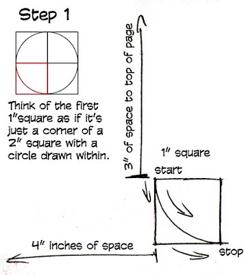
Start by drawing another 1" square, but be sure to leave enough room on your sketchbook page to keep developing from this first square. Assuming you're using a book of at least 8x10", leaving yourself 3" of space above the top side of the square and 4" from the left side to the page edge. Once you have this square drawn, place the point of your pencil in the top left corner and draw an arc down and counterclockwise to the bottom right corner. Try to make this arc as if it were a quarter of a circle.


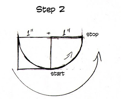
Step 2 picks up right from here and you continue working from the first square. You do not start another square!


If the top right corner of your square had a hinge or pivot point and the right side were able to swing up and to the right it would describe an arc. Also, if you continued the top edge to the right for another inch and ended it where it met the arc you would have the image above.


There are a couple of ways to work to this stage; draw an adjacent square and then the arc or continue the top edge for an additional inch and then draw the rest of the square and then draw an arc within. Either way, you should end up with two squares connected into a rectangle with a half-circle within.


This is where things get a little different. Instead of drawing another 1" square, you're drawing a 2" square. The top of your rectangle becomes the bottom of the square. I really recommend drawing the square and even quickly checking with a ruler for the first time or two you do this. When the square is done, you continue the arc from the top right corner of the rectangle to the top left corner of the new square. The arc you're drawing here is approached exactly the same manner as the previous two you've drawn; as if it's a quarter of a 4"x 4" square.

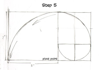
With step 5, we're appending another square to what we've already drawn. This time it's a 3" x 3" square on the left side of the just finished 2" x 3" rectangle. The arc is drawn as before: as if it were a quarter of a 6" circle.


This is the last step for a number of reasons; another square won't fit in the typical sketchbook and we're trying to get this done in fifteen minutes or less. We're drawing a 5" square adjacent to the bottom of the 5"x 3" rectangle and, again drawing an arc. You'll end up with a 5" x 8" rectangle with a nicely drawn spiral arc.


Apart from getting comfortable with one of the more interesting elements of composition, you'll be further developing your ability to guage distance as well as develop more line control as you draw both longer straight lines and increasingly larger curves.


I really appreciate seeing the work you guys have been doing, but it's killing my inbox right now. If you'd like to share it with me and anyone else, I suggest getting a free account at someplace like photobucket or flickr and drop a link in the comments section so everyone can follow your progress.

~R

Thursday 1 January 2009

2009 Zombie


As promised, I'm starting off the year with another zombie drawing.
Few more things to note as the year ends:
- The December Zuda contest ended and Aeons of the Dead won, congratulations to the creator, Dean Hsieh, of course. I have the same misgivings about the strip that I had back when I first reviewed it, but producing a new page every week should certainly give him plenty of opportunities to improve.
- I'm now playing with an idea that could make an interesting Zuda entry, but I have to decide if I will even have the time to make the eight pages any time soon with my pending schedule. As much as I like the idea and format, winning could be a weird work disadvantage to my plans this year.
- Despite my doodle above, my New Year wish is for no more zombie comics. Kirkman's and the ones lurching around in The Goon are enough for me.
- Fingers crossed for a Pittsburgh Super Bowl!
- If I understand my schedule, I start teaching at Durham on the 13th -- lots of stuff to prep before then.
- I finally watched my Iron Man DVD -- the best Marvel hero film ever, though Blade still hits all the right buttons for me. I'm happy Norrington is finally directing again despite the debacle that LOEG was.
-Another drawing exercise to prep for this Saturday as well as a few small assignments to wrap. Despite the increased work load, I'm going to try to keep the updates on this blog steady and try to get close to what I did this past December.
~R