Wednesday 30 June 2010

Thinktank


Introducing the first comics villain I created, Thinktank.

The Hulk had The Leader, so I thought that Pitt had something similar -- so I concocted this guy with a massive head. Inspired by the description of in utero cannibalism in Stephen King's THE DARK HALF I cooked up a case of triplets essentially merging into one infant with all three brains intact while in the womb.

Gross, eh?

I got to kill Thinktank (as much as you can kill any comics character) in the last issue of Pitt I wrote -- the eventual gag was going to be Thinktank's brains would each be popped into one of three creatures developed from Pitt's genetic material. A trio of near-genius minds running around in super-strong, regenerating monsters. That would have been fun to write.

Tuesday 29 June 2010


That's the first page of Pitt: In the Blood. Dale let me go and write, pencil and ink this baby all on my lonesome.

Apparently this issue and all of the Pitt Crew series are actually pretty hard to track down. I looked and couldn't find any copies in my collection and it seems that most online retailers only have a copy or two at best. I know it's anecdotal evidence at best, but that tells me that the books were under-ordered and probably more popular than understood despite the character being absent from publishing for all but three issues of Pitt/The Darkness last year.

By the way, I've started posting my artwork over at Comicartfans.com -- mostly the artist trading cards I've done, but also many of the pages I've been posting here recently. The link can also be found to the right in the box labelled "Personal Links". I've had a number of people ask for artwork and I've always been too disorganized to know what I had available and where to look for it, so this is a part of that whole getting organized I hear works for other folks!

~Richard

Pitt Crew 5 splash page


I thought I sold this ages ago, but it was in the cache of art I found the other week. If I've shared this previously it was a scan of a photocopy. Here you can see the red shift of some marker I used.

Grrrrr! I learned my lesson in the 90s to never use fugitive materials, so stuff like this wouldn't happen. I had bought some markers labeled "permanent pigment markers" in an art store in Ottawa or Montreal. Never saw the brand before, there was no odor and they drew lovely lines on the test paper in the store, so I assumed they were a competitor to Sakura Pigmas or other such non-fade markers on the market.

I recall inking this page with everything, brush, nib and Pigmas. At some point I grabbed one of the new markers and did a little work. The marker flowed fine and I ended up using them on a few other pages. Ugh.

Anyways - -I wrote and drew this issue of Pitt Crew -- the final issue of the series. I used it as an excuse to riff on Conan (with a splash of Kull).

Monday 28 June 2010

Starman and stuff

I think the best experiences I've ever had drawing another person's script for a major publisher was an issue of Starman by James Robinson, which is odd to say considering the number of odd delays and other weirdness that occurred while drawing the issue.

My starting to draw the issue was initially delayed because DC thought James was too far ahead of schedule on Starman.

James patterned the two baddies in the issue on a real-life couple he was acquainted with and he thought it'd be cool if I drew their likenesses. I'm always up for drawing likenesses in comics so I happily waited for the couple to provide photo reference.
Then waited less happily.
Then just waited.
Then we decided to stop waiting and James suggested I draw them to resemble a couple of actors, but we agreed not to go for full-on likenesses for them.

This was during DCs dalliance with their own expedited shipper -- I think they were called Airborne Express. This delivery service were next-day delivery wannabes of the worst sort, James said "If FEDEX are the police, Airborne Express are the Keystone Rent-a-cops" -- I'm probably mangling what he really said.

Anyway, this shipper lost a whole package of artwork To be fair, they blamed Purolator Courier for the loss. PC was their Canadian partner. PC blamed AE for the loss. Regardless, it was the only time any courier lost an art shipment of mine. Wade von Grawbadger had to ink over photocopies of the pages, so he really stepped up to make the issue look as good as it did.

So, there's a whole record of other people making decisions that ended up making me come realy close to blowing the deadline on this issue .

I eventually put a few pages up for auction on ebay, including the one above. The one above was won by an inker from England. He asked for a Starman commission and I agreed. He wanted something that kinda summed up the relationships in the series. Then, of course I let everything else get in the way of doing the commission.

I'd thumbnail out some roughs and even transfer them to board, but then a deadline would come calling at it would get put aside. Returning to the piece later, I'd hate what I did and start again, only to have something else come up.

After a while it became really embarrassing -- I decided I had to put more into it than I normally put into a commission to make up for it, but that required more time and, again, another deadline would come barreling in and push this aside.

This eventually got forgotten until I was about to move out of my studio several years ago and I stumbled across several of the drawings. Decided to stop everything, I sat down, picked one of the roughs, finished it off and mailed it that day. Finally. I felt like a serious fuck-up for taking that long to get to it, but at last it was off my back.
Last October I got a delivery notice, went to the post office and was given a large plastic bag with the cut-up remains of the FEDEX box I had shipped the artwork in. It was opened in customs, the paper I wrapped the FEDEX box in was shredded and only my address was legible, so it shipped to me. And I had to pay to get the package, too.

The art was bent up a bit, but I knew how to fix that. The bad part was I tossed everything having to do with this after I sent the package, so I wasn't even sure I could remember the guy's name properly.

If I felt like a fuck-up before. . . .

I'd recently signed up at comicartfans and have been posting various pieces for sale there and the guy contacted me last week. He was understandably very upset.

I got his address and packaged the art and sent it again the next day. I've been told that bubble envelopes and cardstock are better packing materials if you expect something to be opened by international customs than my usual method, so I did that.

I figured I've been pretty harsh in writing about some other people on my blog and thought it past time I can direct some of that back. Whatever reasons seemed reasonable to put off doing this commission years ago were, ultimately, bullshit reasons. At the very least I should have realized it was taking too long and reimbursed his commission money and just sent the page. It was just ego and stupidity that stopped me from giving up on drawing it.

Sunday 27 June 2010

Big Hair


Yeah. . .

I was waiting for two of my favourite shows to come on tonight. One's about a guy with a really large penis and his life issues and the other is about really pretty guys in Hollywood, hanging out together and doing guy things so I figured I should draw something really, really masculine in case, y'know, someone gets the wrong idea.

Decided something Star Wars-y would fit the bill and put the question on my Facebook status and waited. For a while. Got bored and started channel surfing and I saw something about TWILIGHT and realised these actors have incredibly draw-able faces. So I decided to do a few drawings of young master Rob.

As soon as I started I realised it's been ages since I even tried to caricature anyone. So I drew a few of them.

This guy was made for genre films; outside of retired MMA fighters I've never seen a nose that broken and his hair defies logic and gravity.

I see that I was finally asked to draw something from Star Wars -- an AT-ST! I was kinda hoping for Leia in a slave costume or even C3PO in one, but a chicken-walker?

But I was asked, so I will oblige -- tomorrow night since my manly-man shows are starting!

Star Wars Pin-Up and Comics Agents


I think I drew this late in 1994. A good friend was working with an agency specializing in representing comics artists and I thought I'd give 'em a try. At one point they called and told me Dark Horse was interested in my work and wanted to see me try my hand on a Star Wars pin-up.
At the time the Star Wars comic series I was aware of was Star Wars: Tales of the Jedi: Dark Lords of the Sith (if that isn't one of the longest titles for a comic book I'd be surprised), so that's what I drew elements from for the pin-up. I've no idea who the characters are or why people were flying around on gigantic, formless bat-creatures. The art in the series seemed rushed and unfinished so it was hard to get a grasp of the characters and design. There must have been some implication that this was the book I was supposed to try out for or I think I would have just drawn something from the trilogy.

Something else hit my desk that had to be drawn right away, so I didn't pursue this further for that and other reasons. Despite hearing that Dark Horse liked the piece, no name from editorial was involved in the discussion, so I had no idea what "like" meant in relation to getting an assignment. Further, I was learning that this agency would represent nearly anyone who could competently hold a pencil, or pen, or. . . you get the picture.

There was a very good chance that this pin-up wasn't in response to an editor at Dark Horse saying they liked my work but a result of the agents telling everyone to draw a Star Wars pin-up so they'd have a bunch of options to show the editor.

When I was trying to break in I had heard great things about Mike Friedrich's Star*Reach agency and I had some positive communication with Sandra Cho (I hope I'm remembering her name correctly). She gave great feedback on my work, but also indicated the work had to be at a much higher caliber before they'd represent me. What I heard about them is they did represent their creators; helped find them the sort of work they really wanted to do and made sure they got the best deal they could in doing it. They were picky about their clients so Star*Reach would have a reputation for quality clients when they met with editors and publishers. At the time I drew this piece I think Star*Reach decided to close up shop and do other things, but I probably still wouldn't have been good enough to get on their roster

It was obvious that couldn't be said about these guys. They did get work for some guys, but editors had to sift through some really bad work to see anything good, which barely made these guys any better than sending you samples in through the mail room. I doubt that this agency had malicious intent, but they weren't cut out to do this.

That aside, I think I wanna make some time in the not-too-distant future to draw me some Star Wars stuff. Love it or hate it, it's still one of the best designed and visually exciting universes out there.

Friday 25 June 2010

Excalibur Pin-Up


I drew this pin-up for Marvel way back in '94. I'm more than a little embarrassed over how lame that short-lived signature I tried out was.

I got the original art back a considerably long time after with some sort of yellowing over the baddies' hand. My guess is that the art was in a drawer and in contact with some tape or glue on another piece of art for a few years.

Was never inked or published. I did a number of things for Marvel back then that ended up like this both as artist and writer. Some of that art never resurfaced, though. Possibly it's still buried in some flat file somewhere or was returned to the wrong person.

~R

Thursday 24 June 2010

Nosferatu

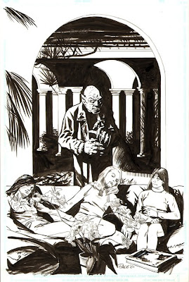
Another unearthed piece -- more recent than yesterday's RUNE stuff, though.

Years ago I was in talks to draw a licensed comic book based on a horror role-playing game; I drew this pin-up as a part of the application process. I don't know if I was asked or volunteered to do it, but there it is.

I've always liked the horror genre and think comics can do it well, but the script I received for the 48-page one-shot wasn't interested in really being a horror comic. It was a goofy exercise with a baseball-capped "Noo Yawk" vampire behind enemy lines during WWII. It had a few nice sequences, but the main character was so goofy that I couldn't stand it. I asked for rewrites even though I laid the book out, but I don't think the publisher was listening or understood that I was telling him that I wasn't going to draw the thing unless it was rewritten to actually be a horror story.

One thing I've learned is that I'm impossible to live with if I'm working on something I hate, so I get out of those situations as quickly as possible.

The interesting thing, to me anyway, is that I found the whole art job I did for the final issue of Millennium's Nosferatu comic. It was really the first full comic I was paid to draw and I ended up penciling, inking and partially rewriting the thing as I went. I think it might be a bit of a blast to post the pages here. I think the author recently put a trade collection of the book out, so it might help him move a few copies.

~Richard

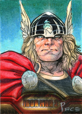
Thor Artist Proof


I really like the new look of Thor -- if something a few years old can be considered new in comics nowadays. I think I'm in the area of what Olivier Coipel is/was doing with Thor's facial structure, but I'd probably need a few more sketches to feel fully comfortable with the head structure and proportions he introduced.

Of course, I wouldn't be doing those drawings on 2.5 x 3.5" pieces of card stock.

~R

Wednesday 23 June 2010

Rune

Spurred by finding a cache of old art the other day:

Many, many years ago in a distant land their existed a sleazy company that existed because it was chosen to be Image Comics' initial publishing partner. This role was so lucrative that they were able to reinvest into and relaunch their own comics publishing venture; Malibu Comics and the ULTRAVERSE! They hired many good and talented people to do this. Many of these people would create brand new characters they would hope to last and entertain well into the future decades.

That, obviously, didn't happen.

What did happen is what usually happens; most of it was forgettable retreads of established properties or ideas or ideas that only worked when their creators were the hands at the wheel. James Robinson's FIREARM, produced with various art-partners, was certainly a case of the latter.

Another was Barry Windsor-Smith's RUNE. The cosmic vampire's book was a beauty to behold when it came out, which wasn't particularly often. Nor was it much to read; it was really a bunch of ideas that appealed to BWS that didn't cohere into an easily understandable narrative. Then Barry quit.
Or was asked to leave.
Or something, because I was asked to draw a pin-up showing how I'd draw Rune:
They then paid me to draw a couple of sample pages, which they stopped me from finishing by giving me the very next issue to draw and telling me I was the new regular artist on the book.

Now, I still loves me that BWS despite his preference toward drawing his comics women to look like butch transsexuals or 13-year old boys. His storytelling, page design and raw drawing ability is always a joy to look at. Not so much a fan of his non-comics work since he tends to fall to far down the too-busy-pre-Rapaelite rabbit hole for my tastes, but it's still recognizably work of a high caliber.

That being said, I have never wanted to be a BWS clone, nor did I think that BWS's thick and decorative line-work had a place in where I was going as an artist.

Malibu decided it did, but didn't tell me.

They assigned a guy from Barry's studio to ink me, Alex Bialy, and told him to make me look as much like Barry as possible.

I understood that a sudden break from Barry to anyone else would be jarring for the readers, so i actually tried to allow what Barry does into my work; I altered my layouts and rendered a little more loosely. This was hindered more than a little by Malibu's paper best described as a cardstock formed from recycled toilet paper. I knew then I had a lot to learn and many, many places I needed to improve in (still do), but I knew what direction I was moving in as an artist.

The combination of what I was capable of and what the inker was doing to the pages was far from anyone's best result. I let my editor know how dissatisfied I was. I only realized later what a shitty position my editor must have been in, but he set up a call between me and Alex.

That's one of the more memorable calls in my career. Now Alex really didn't have anything more to say than "this is how I ink and I was asked to do this to your work." The best part of the phone call would take place right after he said "Barry would like to talk to you."

I could hear the phone being handed over. I could hear breathing as the phone was placed to the man's ear and mouth. There was a pause -- a palpable pause, then he started to speak, "This. . ."
And then ANOTHER PAUSE! Really. Full on showmanship in a phone call. The pause was long enough for the full weight of Barry's ego to come oozing through the phone and into my studio. The pause was long enough for me to understand I was supposed to appreciate I was in the presence of rock star art world greatness.
". . .is Barry Windsor-Smith."
Yeah, he said his full name and I don't think I can really elaborate beyond that how much arrogance came with that. That's the point I realized how shitty a place my editor was in. he had to appease the great and powerful BWS while handling the move from a creator-directed company-co-owned book to a company-directed book while keeping the creator happy.

The rest of the phone call was pretty laughable. You might notice I keep using phone call instead of conversation here and that's intentional. I wasn't talking with Barry, I was talked to. Barry revealed some pretty weird ideas and goals for his studio that would include me only if I were the least bit inclined to think they were goals worth pursuing. It was pretty hard not to laugh at what he said a number of times during the call. He really had no clue what direction the industry was moving in. I let him talk himself out while trying to be respectful. Wished him well, said goodbye then called up my editor and quit.

I had a cover to draw still -- the sketch approved and ready to go:
I really needed to get away from this, though. The idea behind the cover was that there was a new face to Rune and, if I was gone after this issue, the whole episode was pointless.
This is the cover they ran:
I actually think that cover's a better indication of how messed-up things were on the book.

So, I ended up with a pretty shitty work month back in 1995, but I got a great story out of it and learned a great deal.

Malibu was bought by Marvel, folded up and, eventually put away when Marvel realized Malibu didn't fully own the Ultraverse. All those characters, including RUNE, damned to the obscurity of being an also-ran company during the 90s boom.

I still really like Barry's work and hope he drawing well into the future.

Tuesday 22 June 2010

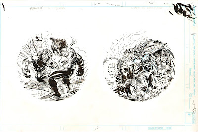
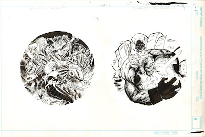
X-Men POGS

Way back in the depths of 1995 I was asked to draw a few of the planned X-Men: Age of Apocalypse pogs.

Some of you may be asking "what are pogs?" To which I answer "I dunno."

Others among you may be asking "what's X-Men: Age of Apocalypse?" To which I answer "Man, what is it with the questions? You're already on the internet, buddy; use Google."
Anyway, they were kinda fun to do, as I recall, and I got to ink them myself, which meant I got to experience that moment of fear before touching pen to paper and the dread of ruining a day's worth of pencilling.


I was clearing out some old folders in my basement and I stumbled across a rather large stack of drawings that I forgot about or thought long gone. I'm gonna share bits and pieces over the next while as I sort through it

Monday 21 June 2010

Two-Gun Raconteur #14


I contributed two illustrations for the current issue of Two-Gun Raconteur: The Definitive Journal of Robert E. Howard.

I encourage all REH fans to go here and order a copy. It's always a great read and re-read.

~R

Friday 18 June 2010

Thankful Wolverine


Did a quick sketch on a piece of old Marvel art board I used as part of the protective wrapping for a set of art cards.

There's a certain benefit to using artist grade paper for packing material here.

Tuesday 15 June 2010

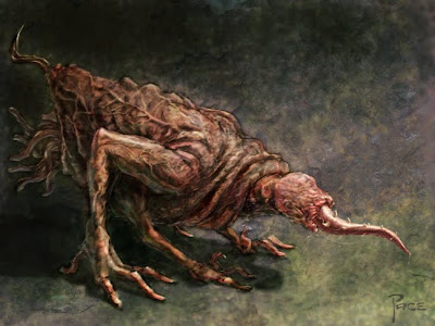
Quick and Gross Critter


Posting this update last night on Facebook caused the above:

"When stuck for scary critters to draw I take a page outta H.R. Giger's book and start adding limbs, teeth and claws to genitalia. If you're feeling particularly Lovecraftian, add a dash of squid!"

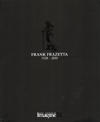
ImagineFX Frazetta Tribute Cover

Just checked my mail and found the latest issue of ImagineFX. I knew it was supposed to be a Manga special this month, but that was about it. So when I opened it I was surprised to see this:
I was already in a pretty bad place after hearing about Al Williamson passing away yesterday, so this hit me right in the heart.

It's the subscriber-only cover, so they can get away with bold design like this (the cover is matte black with spot varnish for the drawing and the FX part of the logo if it isn't clear on the screen), but this sort of grace note really shows the IFX crew to be a class act.

Friday 11 June 2010

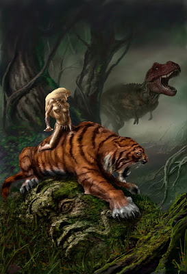
Jungle Girl update -- dinos!


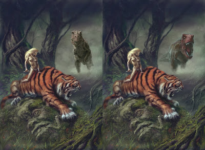
I stole some time to get back to this painting this morning. I drew a bunch more dinosaurs and tried them in the hole made by erasing the previous T-rex. So far I've just "colourized" the pencil drawings and smudged and erased a bit to get them in the direction of matching the rest of the piece. It's kind of obvious they're both sitting on different layers and I haven't done any painting to them yet.
Gonna let these sit a bit before I decide on which one to go with and exact placement. Right now the left one looks too centered in the opening and the right one could be rotated counter-clockwise a bit to feel more like it's moving.
I've also decided I have to place a few more bit of ruin here and there so the giant stone head makes a bit more sense

Wednesday 9 June 2010

Bendis Board Wolverine


The Redesign Club thread started up again over at the Bendis Board. This week it's Wolverine's costume on the drawing board. When it comes down to it, regardless of whatever Logan puts on, it always returns to something like this.

Tuesday 8 June 2010

Post-Convention catching up

Still scrambling around playing catch-up after the convention this past weekend and working on a few things I'm not able to share here for a while yet.

However, I did get this in my e-mail this morning:
It's one of the sketches I did at the Wizardworld Toronto a while back. I'm happy to see that CGC didn't ding the value of the book too much for having my scribbles all over the cover.

A little while ago I got a scan of another sketch I did at that show:

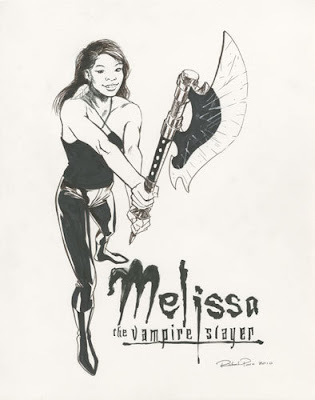
I have a deep and abiding love for most things Joss Whedon has created, so drawing this con attendee as a vampire slayer was a double treat.

***
I actually brought my camera to take snaps of the sketches I did at the show, but completely forgot it was in my bag both days. The con was pretty laid back, so I think I spent hours on a few of the sketches. I was actually working on a Mephisto for one attendee as the show ended. Dale wanted to head out and I couldn't see the gentleman anywhere, so I packed up the piece. It's one of the few times I didn't take payment up-front, so I hope he isn't too upset that he didn't get his sketch. I might polish it up a bit and share it here since I'm pretty happy with it so far.

Next show for me is the big August FanExpo in Toronto. Really looking forward to that one.

***
I've made up my mind to redraw the T-Rex in Jungle Girl, so that'll come before wrapping up that painting. I'll see how the week develops, but I'm hoping to get it squared away soon.

Sunday 6 June 2010

Jungle Girls Update 6

Spent about an hour or two on this so far this morning. Realized the tools I needed at this stage were in Painter, so I flattened it and ported it out of Pshop. There's still a rather long list of things I want to finish or tweak, but I don't want to rush this as I'm really enjoying the process and pace of it, so it'll get done Monday instead of today for the second and last day of the convention.

Dunno if the work that apparent from the last WIP, but it feels like I've done a lot of smaller, but important changes to the overall piece.

So far I'm pretty happy with the trees in the midground, but everything else needs more work. I might redo the T-rex completely, or at least turn its head so it seems like its looking at the main characters (yeah, I know T-rex's had horrible forward vision) -- it might be me, but it's pulling me to close to the edge of the image today.

Also have to make up my mind about what sort of dagger she'll be holding -- but that'll get drawn in pshop.

Saturday 5 June 2010

Jungle Girls Update 5


Grrrrr. The clock beat me. This is all I'm able to to before I have to start getting ready for the con today. Put, maybe, another 40 minutes in this morning, but the changes and additions are getting smaller and incrementally less noticeable. I did notice that my monitor calibrations were off again, so the image needed quite a bit of tweaking on alteration layers to fix that.

Still lots to do on the main figures -- hopefully I won't be too fried and I'll wrap it up tonight after the con.

Jungle Girls Update 4


4:41 in the morning -- the dinosaur has put me way behind where I'd thought I'd be (done), but it's worth it, I think. The main colours are all in, but it needs a few more passes, adjustments and a knife before I can call this done. Don't trust myself to do that too well when I'm this tired and looking at a full day at a con, so Ima gonna gets sum Zzzzzzzz. . . .

. . . And try and wrap this up in the morning before I drive out to the con.

Friday 4 June 2010

Jungle Girls Update 3


So, my son looks at the screen while I'm working on this and asks what the ruins I'm drawing are for. When I really don't have a good answer, he goes "Why don't you add a dinosaur or something."

So, deleted the ruins layer and about two hours work and drew a T-rex. Prolly gonna put another hour or so into that then start working toward the top layer, leaving the girl and tiger for last.

Gonna be a late night, I think.

Jungle Girls Update 2


Slapped tones on the tiger -- yeah, decided I really want that orange/red happening in the foreground. Just as I saved this as a jpeg I realized I hadn't finished the jungle girl's leg. Gonna quickly do that before I start blocking in a background.

The jpegs I'm putting up here are work size -- 15x22"@300 dpi, 150% of my intended print size.

Jungle Girl update

Update:

I'm rendering in the values in black and white. At this point she kinda looks a bit like Storm from the X-Men, though I'm intending to lighten the values to make her flesh tones that ghostly-white that so many of Fritz's women had. When I start to colour I might change my mind -- it depends on how the overall piece starts fitting together when I start blocking in background and colour.

Thinking I might make the cat a jaguar, though a reddish orange tiger would pop from the greens I'm envisioning for the environment. Many hours to make up my mind as I start toning the cat then putting together a speedpaint for the background. For that, it's gotta be overgrown ruins of some sort.

Jungle Girl Print for FanExpo

Decided to try and squeeze in a piece of artwork to make a print for this weekend's Fan Appreciation Event in Toronto:
Yesterday I did a bunch of thumbs after I developed an inkling of what I wanted to draw. I've been itching to do something Frazetta-inspired since his passing. I didn't want to just draw or redraw one of his classic pieces, so I focussed on the things that really said "Frazetta" to me. Despite his amazing male figures, it has always been his women and big cats that made the biggest impression on me. So, some sexy amazon astride a giant lion/tiger-type -- perhaps even a sabertooth in some dark jungle ruins is what my brain spat out after ruminating while chugging away on an elliptical machine in my gym.
I really like drawing parts of a piece at a size comfortable to draw that part at. Working on 14x17"bond, the above cat is about 12" wide. It's been a while since I drew something like this, so I pulled out my various How To - books to make sure I was getting the forms right. There was no way I was going to draw the jungle girl that size and get anything I could be happy with, so I merely placed in a scribbly manikin for gesture and position so I would have a good feel for how I'd position the girl.

The above drawing is around 14"tall -- so it's even larger than the cat above despite how small she's going to be in the final piece. Working this large allows me to draw with my arm instead of my wrist which, hopefully, allows the figure to look more fluid. The details that show large here, will largely disappear in the final, but the suggestion of the necklace and other ornamentation will work better if I can place it accurately on the form -- something that's easier to do at a larger size.

here's how they look merged together:

I have an image in my mind of how the rest of the composition works out, but that's something I'll actually do when I start painting in photoshop later today.

Wednesday 2 June 2010

Kreativ Blogger Award

So, I was just awarded this:


Given to me by Cromsblood of the CROM! blog. Cool -- last time I was ever nominated or received a web-based award I was still hanging around usenet, years before this blog even existed (or I even heard of blogging).

Like most things web-based, it's trying to go viral, so there's rules attached to this award:

(1) Thank the person that nominated me.
(2) Copy the award and put it on my blog.
(3) Link back to the blog that nominated me (C
ROM! ).
(4) Name seven things about myself other people might find interesting… listed below.
(5) Nominate seven other Kreativ Bloggers… also below.
(6) Leave a comment on their blogs so they know they’ve been nominated… get on that later today.

Seven Things people might find interesting about me. Hmm. Guessing my usual audience here, I'll try to come up with things that would be interesting to this group.
  1. As comfortable as I am with digital media, I enjoy the feel of graphite sliding across the surface of a smooth paper so much that I don't think I'll ever go completely digital.
  2. Arnold Schwarzenegger and I were urinal neighbors in a restaurant mens room some time after the movie Twins was released.
  3. While I agree that contemporary art education is largely in the toilet, I don't think we can turn back the clock and try to teach it in the same manner as the "good old days".
  4. Thinks that there's going to be some sort of interactive experience splicing together multiplayer video games and a traditional movie narrative in a movie theater within the next 10-20 years.
  5. I don't take care of my floppy comics on purpose.
  6. I think DC Comics is still and always will be a confused mess over not having the balls to ditch the golden age heroes and Legion of Superheroes during Crisis on Infinite Earths
  7. I'd drop anything and everything to work with Howard Chaykin once.
My seven nominees:
Dr. Sketchy's Toronto - wish I could get out there more often.
Ty Templeton's Art Land - free comics every weekend and lots of the funny
She's My Kind of Girl - needs to be updated more often!
Illustration Art - great pictures and good reading
The Labyrinth -- one of Canada's best bookstores
Gurney Journey -- James Gurney!
Mike Wieringo -- one of the best friends I've ever had. Still miss him whenever I finish something I think he'd like to see.

Off to leave the comments.

Some art goes up later today.